
There’s nothing like a simple chart to help you quickly understand inequality, poverty, or anything else you might be interested in. That’s why I’ve assembled this list of the best data visualization resources, as I think they’re some of the most powerful tools for boosting your understanding of the world and the economy.
Even today, with the most educated populace in world history, most people misunderstand elementary facts about issues like poverty, crime, and pollution – generally thinking the world is in a worse shape than it really is.
Taking advantage of these resources will not only help you be better informed about the world, but the big picture economic understanding will help you interpret world events more accurately.
The sites I list here, have created data visualizations that are truly astonishing. They cover, international trade, economic opportunity by US neighborhood, and information on topics as diverse as pollution and democracy. Resources like these are what I wish I had access to when I was a kid.
1. The Globe and Atlas of Economic Complexity
Using different colored pixels arranged over the globe, this visualization will help you understand international trade intuitively. Who are the US’ top 10 trading partners? Does the US export few types of products or many? Which products are exported on the West Coast vs the East Coast? Learn all this and more about any country in a stunning visualization tool.
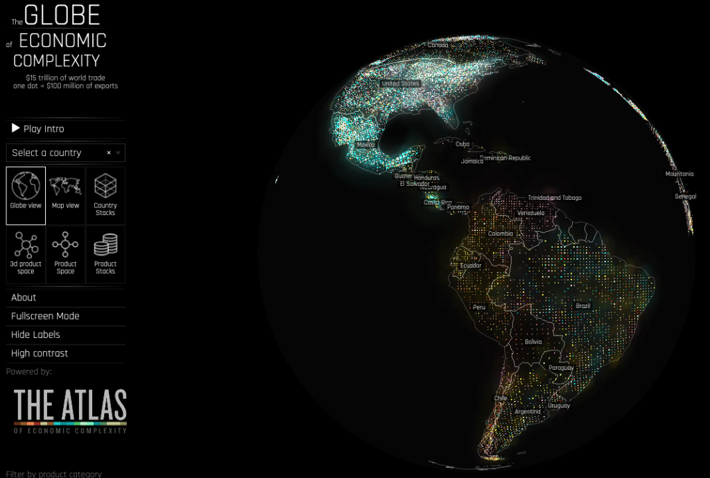
Their atlas tool breaks trade down into even more simple graphics by country. It also summarizes the country’s economy in various ways, such as expected future growth, and the complexity of its exports.
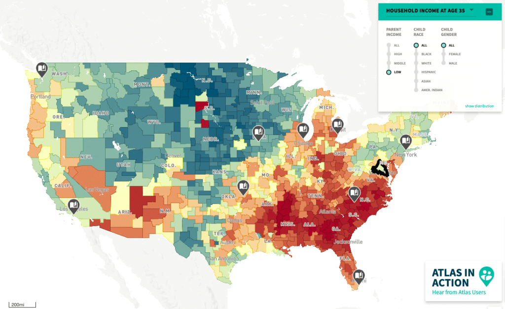
2. The Opportunity ATLAS
“Which neighborhoods in America offer children the best chance to rise out of poverty?” This is the goal of the Opportunity Atlas. It breaks down key outcomes of adults by the neighborhood they were raised in. In effect, this tool is a map of the best and worst American neighborhoods to grow up in.
It tracks adult outcomes like income, incarceration rate, teen pregnancy rate, and much more. I looked at the neighborhood I grew up in and those nearby, and the outcomes matched well with what I expected.
3. Gapminder
Gapminder is an easy to use tool to understand various global issues. You simply choose an outcome on the Y-axis (like life expectancy) of a graph and plot against another variable on the X-axis (like GDP per capita); and voila, you will instantly see the relationship for all countries of the world.
Just be careful not to interpret the relationship you see as proof of causation.
For example, I looked at the relationship between child mortality and CO2 emissions and found that the countries with higher CO2 emissions had less infant mortality. Yet this doesn’t mean that the CO2 emissions are what’s improving child mortality. A better explanation is that industrialized countries are richer and have better healthcare – and emit more CO2.
4. Our World In Data
Our World in Data has become one of my favorite sources for understanding big ideas quickly. They’ll take a topic, like income inequality, and with a series of visualizations alongside some commentary give you the lowdown on what’s going on. Their site uses the work of many scholars and covers topics as diverse as Food and Agriculture to Democracy.
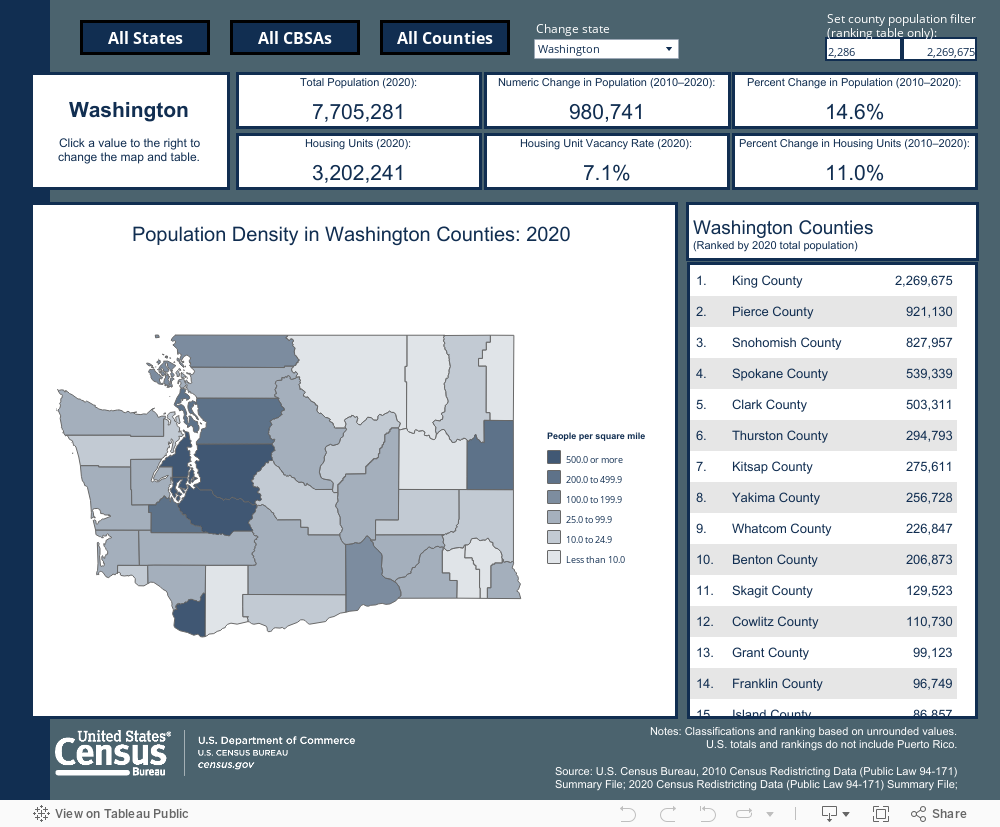
5. US Census Infographics and Visualizations
The US Census prepares visualizations on all kinds of interesting topics related to the US economy that you are probably curious about but just didn’t know existed.
One of my favorites is the below visualization of population density by US county. Another is a fascinating visualization that breaks down race and ethnicity by State.
Those are my top 5 favorite economic data visualization sources. Of course, there are many more sources of economic data where you can assemble custom graphs, but they may not have as smooth of an interface as the others I mentioned earlier. Other good sources include the World Bank (global data), and the St. Louis Fed (US economy data).
Have another source you use that displays data elegantly for efficient understanding? I’d love to hear about it in the comments.
If you liked this post, I think you’ll also like my post on my recommended resources for learning economics.